The Annoying All White Backgrounds or Lack of Publishing Style

Mr.Max

Look Before You Leap!
Joined
Mar 27, 2012
Messages
139
This is a bit of a rant, so please forgive and bear with me. I don't know about you guys but I have a pet peeve when it comes to hobby magazines these days, am I the only one who is annoyed by this growing trend of horribly bland, all-white backgrounds models are placed? I'm very, VERY annoyed and a bit perplexed. :mad:

What is with the insistence of this dull presentation? Kalmbach Publishing is the worst offender when it comes to this, nearly everyone of their publications has this weird, boring and uninspired format and presentation aside from Model Railroader Magazine and "How To Build Dioramas" 2nd ed. There is absolutely NO style or ambiance to how cars, aircraft or AFVs are featured, everything is against this glaring white background and I'd love to see it change. Certainly where muddy, dirty tanks and such are concerned!

The main question I'm getting at is why, why do FSM and a number of other hobby mags have this dull background? I understand not every model has to or should be set in a loving and painstakingly created background (it'd be nice) but a neutral or light colored bg and effective lighting would go a long way to a better presentation in my opinion. ([size=8pt]I'm sure you'll agree![/size])
 
From a product photography point of view.
A dark object, especially one with a lot of detail projects better on a light or white background. With a darker backdrop the detail gets washed out. The opposite is true for a light coloured object projects better with a darker backdrop. Therefore since most of our models are darker in colour a light backdrop is preferred. Another aspect is from the publisher that cost wise the more white the backdrop the less ink and cheaper to produce.
That is my take on the reasoning.

Jim
 
^^What he said.

Simple photography 101, if it a dark colored object you are trying to photograph, then you need a light background. Light colored object, requires a dark background.

Now, alot of "trickery" can be done with photoshop, but if you don't know how to use, or don't have access to PS or similar program, that is the simplest way to have your photos come out better.
 
Also Editors (not all) ask for white (or plain, Airfix Model World ask for Electric Blue :p) backgrounds as it's easier to cut/crop the image to add writing around it or whatever, and it's easier to use after effects on a image on a white background. I shoot my images for mags on white but sometimes I curve the white sheet of paper/card which gives a nice grey gradient effect.
 
It's really simple to be perfectly honest.

It's the easiest background to work with, from an art department point of view. Be it placing the model among text, or creating an artistic background to overlay the model onto in Photoshop.


Besides, what are the options, a colored background? How would a solid blue/grey/black/orange etc. background be more 'stylish'? We have models in the magazine on white, black, blue, grey etc. and I don't see any difference in the "publishing style" when it comes to color behind the model in those little squares on the page, it's all in what the art department does to the design and page layout, which is where the publishers 'style' is found and to be honest, has little to nothing to do with the model backdrop color.

They do make those fading, gradient backgrounds and I have two of them, 'Gulf Blue' and 'Thunder Grey' that were supplied to me for working for a particular publisher as that's what they (initially) required. Personally I think they remind me of grammar school pictures and every time I see a model on one I can feel those cheap combs they supplied right before the shoot sticking me in the leg pocket.


There are a few models that have been pitched to me for the magazine, on textured backgrounds where I can see the dimples of the paper towel, the weave of the cloth, or the speckle of the Formica counter top. Unfortunately, they are too distracting and look lousy in print when placed in amongst the text and the color of the paper, which only exaggerates these shortcomings.

It doesn't have anything to do with ink or printing as our cost to print is a flat rate per page, regardless of colored backgrounds or white backgrounds, 64 pages costs a 64 page cost, whether they are 64 pages of stark white, or a field of wildflowers.

And to be frank, the whole focus of a photo of a model in a how to article is the model. A busy background would only detract the attention of the viewer from that.

I can see maybe a lead in photo for the article on some Photoshopped background of trees and Bambi and a babbling brook to set the mood ;D but aside from that, what's the purpose of the article? Is it to teach the reader how to build/paint/weather the model with clear and concise photos to follow, or to come across more like a comic book with motion lines and text bubbles that say WHAM!?

8)
 
An even simpler answer...
It's because the Art Director who is directing the photoshoot decided that's the background he/she wants on the cover of their publication.

As for "tweaking it" or "fixing it in Photoshop" ( I cringe when I hear those expressions), it's the latest fad of the young photographers coming out of Photo Class. They don't take the time to do a shoot right and proper, they just shoot half assed and "fix it in Photo Shop".
 
Black Sheep 1 said:
An even simpler answer...
It's because the Art Director who is directing the photoshoot decided that's the background he/she wants on the cover of their publication.

As for "tweaking it" or "fixing it in Photoshop" ( I cringe when I hear those expressions), it's the latest fad of the young photographers coming out of Photo Class. They don't take the time to do a shoot right and proper, they just shoot half assed and "fix it in Photo Shop".


Contributors to model magazines shoot their models on whatever they shoot their models, they don't take any direction from Art Directors. The art department merely picks and chooses what he can use and works with what he has. Most contributors are just hobbyists, without any professional experience and/or equipment.


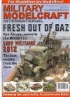
Having said that, my GAZ with Bofors that was on the cover of Military Modelcraft International was taken on a white background, and it made the art departments job of placing it on the cover, overlaying the other models, the artistic backdrop, the text etc., that much easier.


003_zpsbc8cae1f.jpg


As for fixing it in Photoshop, that's not what I meant, but without Photoshop, there would be outlines around the photo where it was cut to fit the text, or shadows that get cut off and end abruptly when laid on top of text etc. It's not about fixing bad photos, or faking the shot.

;)


*

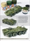
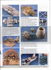
Now, back to the topic of white backgrounds versus colored, here are two pages scanned from another magazine, (Military in Scale, October 2012) both pages are found in the same issue, same publisher, same art department. Which page has more style?


two2_zps96038918.jpg


one1_zps31a508ac.jpg


While the model on the white background appears clean and fresh, and blends into the entire page seamlessly, the other page looks cobbled together, as the textured cloth of the blue background (which even shifts in tone from photo to photo) adds nothing to the artistic look or style of the page.
 
Ken Abrams said:
Black Sheep 1 said:
An even simpler answer...
It's because the Art Director who is directing the photoshoot decided that's the background he/she wants on the cover of their publication.

As for "tweaking it" or "fixing it in Photoshop" ( I cringe when I hear those expressions), it's the latest fad of the young photographers coming out of Photo Class. They don't take the time to do a shoot right and proper, they just shoot half assed and "fix it in Photo Shop".


Contributors to model magazines shoot their models on whatever they shoot their models, they don't take any direction from Art Directors. The art department merely picks and chooses what he can use and works with what he has. Most contributors are just hobbyists, without any professional experience and/or equipment.


Having said that, my GAZ with Bofors that was on the cover of Military Modelcraft International was taken on a white background, and it made the art departments job of placing it on the cover, overlaying the other models, the artistic backdrop, the text etc., that much easier.


As for fixing it in Photoshop, that's not what I meant, but without Photoshop, there would be outlines around the photo where it was cut to fit the text, or shadows that get cut off and end abruptly when laid on top of text etc. It's not about fixing bad photos, or faking the shot.

;)
Ah well, that's the world of the hobbyist publications I guess.
In the area of Commercial Photography that I used to be in, the AD always directs the shoot.
That goes for Commercial Fashion Photography as well (at least in NYC anyways).

As for my comment on Photo Shop, I was referring to something ECH said.
 
Black Sheep 1 said:
Ah well, that's the world of the hobbyist publications I guess.

Oh yeah, I agree 100%

I'm sure Womans Day, Playboy, Sports Illustrated, FHM etc. all do it exactly how you said but this industry is extremely reliant on Joe Shmoe and a shoe string budget. ;)
 
I like the clean white look better, to me it is not trying to hide, camouflage or distract from the material...

I used to subscribe for years to another magazine that under different editors had many "themes" for want of a better phrase, some were terrible and looking back it was obvious they were over busy in the colouring department rather than the content department. ::)
 
I am one of those that uses the blue material (I also have white), and the only reason I use the material is because it is easier to store and to keep it straight than a piece of bristol board or other paper product. The cloth I can fold up and put in a drawer. Then again, I don't do stuff for magazines, just for my own amusement, more or less that I am too chicken to submit something. The photos I can do somewhat competently I think, just the writing of the article, I always feel like I am rambling on and on. But I guess that is what the editors get paid the big bucks to do! ;)

About the only thing I do in PS is to hit the auto correct. I have 3 swing arm lamps all with 100w equivalent CF bulbs, and an over head light that has 3 60w equivalent CF bulbs, but the pictures still seem to come out with a yellow tinge to them (I admit though, I don't fool around with the white balance on the camera, which is likely the problem), so I just do the ole' auto correct in PS, and makes them look better. Of course do the whole crop 2 step as well.

Shot before auto-correct

IMG_2464-vi.jpg

And after

IMG_3019-vi.jpg

The after has much less yellow in it (but could probably be better still), detail is more prevalent. Granted not the same photo and the later one is obviously of the finished product, but you get my drift.

The trickery I speak of in PS, that a plain background is good for is to take a tank, or other vehicle and place it on a real background to look like it is rolling through a forest or field, add a little blur to the wheels/tracks and some dust kicked up and it looks like it is in motion. Well out of my field of being able to use PS (although I am sure it is fairly simple and easy to learn), but I have seen it done well by others.
 
Elm City Hobbies said:
I am one of those that uses the blue material ... Then again, I don't do stuff for magazines,

Well, that's fine, peeps can post pics from their kitchen tables, cutting mats, tree stumps in their yard, basement benches, picture window sills etc. for forum pics.

;)
 
Ken Abrams said:
Elm City Hobbies said:
I am one of those that uses the blue material ... Then again, I don't do stuff for magazines,

Well, that's fine, peeps can post pics from their kitchen tables, cutting mats, tree stumps in their yard, basement benches, picture window sills etc. for forum pics.

;)

So you wouldn't consider that (the 2nd pic obviously) to be magazines worthy?

I should try and take them again on a white back ground to see which looks better. Just always found a light colored vehicle can get a little washed out on a which background.
 
It's not as much about being 'worthy', as it's just an extremely difficult background to work with.

Unless of course it's just stuck on the page in little squares, like my example above.
 
Okay, I can understand the cost issue as to why most things have gone to white but I think I'm just spoiled because I've looked through numerous issues of ModelGraphix and Hobby Japan magazines and marveled at the beautiful and stunning photography and stylish presentation. Even though I can't read Japanese in any of it's forms (aside from being able to pick out a few characters or logos) I was always impressed with the level attention and presentation given to even fictitious vehicles like mobile suits or other sci-fi things not to mention aircraft. Has anyone seen the article in Hobby Japan called "Air Combat"? I absolutely love that section! THAT's how you present aircraft models, such attention to detail, respect for the given subject and ambiance that puts to SHAME anything in western hobby magazines. Perhaps I'm in the extreme minority on this point. :p

So, maybe the answer was starring me in the face all this time, it's budget and perhaps time constraints that cause our hobby mags, while offering good and helpful information, to sadly come across as extremely bland visually; don't get me started about the weak fonts either!! :mad:
 
Mr.Max said:
Okay, I can understand the cost issue as to why most things have gone to white but I think I'm just spoiled because I've looked through numerous issues of ModelGraphix and Hobby Japan magazines and marveled at the beautiful and stunning photography and stylish presentation. Even though I can't read Japanese in any of it's forms (aside from being able to pick out a few characters or logos) I was always impressed with the level attention and presentation given to even fictitious vehicles like mobile suits or other sci-fi things not to mention aircraft. Has anyone seen the article in Hobby Japan called "Air Combat"? I absolutely love that section! THAT's how you present aircraft models, such attention to detail, respect for the given subject and ambiance that puts to SHAME anything in western hobby magazines. Perhaps I'm in the extreme minority on this point. :p

So, maybe the answer was starring me in the face all this time, it's budget and perhaps time constraints that cause our hobby mags, while offering good and helpful information, to sadly come across as extremely bland visually; don't get me started about the weak fonts either!! :mad:

Most likely the images i those Japanese publications are being shot by the publication photographers and not by the hobbyist themselves. The Japanese strive for perfection and excellence in everything they do.
I think that is why the hobby is so popular there as it is viewed as an art form as opposed to the US where model building is viewed as a kids toy of a "Geek" thing and not taken seriously. and that is just too bad.
What is worse is that we have an organization here for the hobby that is doing absolutely NOTHING to promote the hobby and elevate it to a higher level (compared to countries like Spain and Japan and South America), the IPMS/USA.
 
I also hate the white BG I think it can ruin the colors on a model for this reason I use Grey.

but i gave up on magazines there not worth the money you can find far more on the web for free.

But i do like the new SMA mag and the AK ones
 
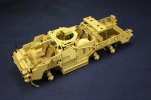
Sounds more like photographer error and not the color of the background 'ruining' the colors.


6_zpsab049bae.jpg
 
Mr.Max said:
Okay, I can understand the cost issue as to why most things have gone to white

Um, like I said... it has nothing to do with cost.

Our print quote is flat rate per page, paper thickness, size and coating.


Mr.Max said:
...don't get me started about the weak fonts either!!

Not sure what 'weak' means but I think the fonts chosen are simply for ease of readability?
 
lol Ken to be Fair you just recolored them there is a big Difference on a bright white BG i think, the main difference in those is that they are easier to look at than the white one
 

Latest posts

Back
Top