SU152
- Thread starter Grumpa
- Start date
- Joined
- Sep 4, 2022
- Messages
- 1,935
I like the desaturated, all the way to B&W shots. Tempted to give that a try...
I wonder if they have the same effect on under-40-year-olds? What is it about them that strikes a chord in my 66 year old brain?
Is it memories of paging through my parents' photo albums, or the fact that so much media was not colour in childhood, movies, newspapers, illustrations, TV and photos? Like the BBC newsreels airing on our CBC.
It may just be that by not being full colour, my brain enters into a state of suspended disbelief, happily participating in the 'reconstruction' of the image in my head.
Design nerd alert!
From a cognitive point of view, we know that the colour receptors in our eyes are clustered in the center of the retina, and when we look straight ahead, our field of vision transitions from colour in the middle, through back and white, to just detecting movement on the extreme periphery.
These B&W receptors are very good at detecting contrast, patterns and volumes. Without being distracted by colour (which tends to flatten things out) we appreciate the shapes, textures, patterns and volumes defined by the shadows and highlights.
Wow! I need to do more b&w pics!I like the desaturated, all the way to B&W shots. Tempted to give that a try...
I wonder if they have the same effect on under-40-year-olds? What is it about them that strikes a chord in my 66 year old brain?
Is it memories of paging through my parents' photo albums, or the fact that so much media was not colour in childhood, movies, newspapers, illustrations, TV and photos? Like the BBC newsreels airing on our CBC.
It may just be that by not being full colour, my brain enters into a state of suspended disbelief, happily participating in the 'reconstruction' of the image in my head.
Design nerd alert!
- Joined
- Sep 4, 2022
- Messages
- 1,935
Sure, though your restrained, muted palette has much the same effect. Think old sepia photographs and the way details jump out at you...more b&w pics!
What is "sepia" ?Sure, though your restrained, muted palette has much the same effect. Think old sepia photographs and the way details jump out at you...
- Joined
- Sep 4, 2022
- Messages
- 1,935
In art school, I learned to do 'underpaintings' in sepia (apparently a pigment from the ink sack of the 'common cuttlefish'). This is a very old technique to build the composition, light and dark areas, give depth before adding colour oils. We also did drawings and sketches using Conte sticks (chalky pastel like sticks) that were in sepia tones.
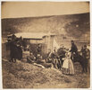
Early photography was often in 'sepia' tones.
According to Mr Googles,

Early photography was often in 'sepia' tones.
According to Mr Googles,
It was also popular because it seemed warmer and more natural than B&W. Modern digital cameras and software often have 'filters' built in to get that effect.The chemical process used in sepia toning created a more stable and resistant print


